MAGIC REALIZM


GARDENING (2011)
Intaglio print on crappy Stonehenge print-test paper. I will upload a less-yellow version of the print sometime soon. In the meantime, dig the sepia.

NEFFY AND MOC (2011)
intaglio print with surface roll on AWESOME ARCHES!!

ABANDONED (2011)
intaglio print with a surface roll on Arches printmaking paper

A Coney Island of the Basement Mind (2009)
Ink and Faber Castell Marker on Strathmore Paper

MARTHA'S HANDFUL (2011)
Can't really explain the title to this one. This drawing is a little bit different because it is a modified master copy of an under-appreciated symbolist painting by a late 1800's artist whose name I cannot remember. Colored Pencil on Matte Board. Currently owned by the boyfriend of a guy I know. It was given as a birthday present.

Ink on Matte Board. Based on a photograph taken at Chincoteague Island in Virginia. The horse stuck its head into our car, and either my dad or myself took a picture of it. On second thought, it was actually a wild pony. Google Chincoteague so I don't have to explain it on this blog.

YOUNGER THAN YESTERDAY (2011)
India Ink on Illustration Board. You have no idea how many ants assaulted me while I was trying to render the underbelly of this drawing. Drawing outside sucks if you don't have the good sense to bring a blanket.

VIEW FROM THE DORM ROOM (2010)
I made this my junior year of college. I was living in a single at the time. I wanted to make the scene electric by describing it with hairy line work. It got a so-so critique when I brought it into class. The main complaint was that the values were undefined. Personally, I don't buy any of that. I did when they said it, but I don't now.

TANK
2012
Starring John Cusack
and Whitney Cummings
Oil on canvas purchased at DICKBLICK.COM
This is kind of an awesome painting, but kind of a shitty painting at the same time. And what I mean by that is, despite having moments of awesomeness, and drama, you have to kind of wash that down with the fact that the colors are kind of muddy. There is a pervading muddy gray that starts to contaminate this painting, and it is the cancer of this canvas. The muddy gray is a result of me running out of turpentine due to a tight budget. What little turpentine I had was at the bottom of the jar. It spreads outward like a fearful dandelion. Like a puree of mashed pigeons shitting into the little cracks in the corners of a new york city subway. Is this painting political? Is Urkel hard to spell backwards? I dare you to dress up in a cop's uniform and pull over someone on the side of the road and ask them to spell Urkel backwards. 9 times out of ten they won't oblige.

SCENE FROM 'THE BERLABANGS' SHORT STORY
Abobe Photoshop painting
2010
My Art Institute of Boston Years: 2008-2012
I remember when Obama won. It was freshman year, and all the students were in the cafeteria watching the election on a giant screen. A truly magical moment. I'm not sure why, but for whatever reason tiny cans of pepsi were being passed around.
All you can sometimes do is wait for something to happen. When it does happen, you won't realize that it's happening until it's over. It is at that point that you will realize that it was indeed something that had happened, and you will spend the rest of your life trying to figure out why it happened instead of what it was that was actually happening. That's the difference between being present and opening presents.

CHIMERA
2012
Oil on Canvas
It doesn't look promising at first but give it a chance and it'll grow on you.
Feel free to chime in at any point, Buster.

I feel as though this has already been uploaded on here. If it hasn't, I apologize for making you think that it has.
This is a drawing/painting/scribbling/text of my friend Christopher Beegle glueing Pogs (We'll get to that in a second, class) onto a stuffed shark bust. It's one to have a Kung Fu poster of Green Day hanging up in your room. It's quite another to have a stuffed shark tiled in pogs and globs of fiberglass.
Does anyone listen to Broadcast? How about Sparklehorse? How about School of Seven Bells? How about Telefon Tel Aviv? How about the Beastie Boys?
okay. okay. That's enough for now.
Remember you can click on the images at any time to enhance your visual experience.

Title:
ORIGAMI UNICORN
Oil on Canvas
2011
This is an origami crane, yes. But it is titled after the origami unicorn motif in the Ridley Scott-directed film Blade Runner, which came out in 1982 (My favorite year for movies pretty much.) All of the best horror films came out in 1982. Creepshow, The Thing, Basket Case, Poltergeist, E.T. (Which normally isn't included as a horror film when, in actuality, it has all the trappings of a traditional horror film. You have a suburban household, a bewildered alien, and a painting of an origami crane pinned to a pair of dark blue underwear against an ostensibly white wall.
Soudtrack for this painting: Track 3 of CLAMS CASINO's first MIXTAPE (2011)

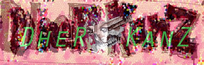
Title: Dher Kanz vs. the Dragon
Year: 2007
Medium: Oil Paint on a Masonite hexagon. The Masonite was already gessoed when I found it...so I'm not sure if there was already something underneath and my dad was planning on painting it. Over the holiday break I almost considered traveling with this monstrosity up to Boston...I'm glad I never succeeded, is all I'm saying....
This is a take on St. George and the Dragon. I don't think it flew over too well my senior year of high school. The common criticism was that the dragon wasn't well-integrated enough into the rest of the painting. Now when I look at it the turtle is what bothers me most. It's just a gray blank color that looks like it doesn't wanna be there. Like an old grape that fell under the kitchen cabinet only to be discovered weeks later!
This one is certainly a bit of an outlier in this category, because it doesn't really share any of the spirit of Magic Realism. But that's okay, because it needs to go somewhere, and I'm not putting it in Life Drawing. (Ba Da Bing) Yippee Ki Yay....

Title: IronCat
Medium: paintmarker, colored pencil and acrylic on illustration board.
Year: 2010
The cat can only look outside of itself, it cannot look in.
Pelvis Esley.

I'm going to still technically count this as magik realism because I did use actually photos of animals as reference AND I really am attempting to inject some real depth in there. Notice the tonal gradations from light to dark...The characters on the border are a cheap attempt to emulate Mad Magazine's Sergio-Argonez-Illustrated cover borders which ran through a dozen issues in the late 90's.
Title: I don't remember why I belong here but I'm too old to care anymore
Medium: Acrylic and Marker on Illustration Board. Some Pen and Ink as well.
Year: 2013

Title: Goodbye Bread
Medium: Ink on Illustration Board
Year: 2011
My Top 5 Album Covers of All Time: (See if you can spot the titular album's cover in this drawing.)
M83: Lost Cities, Red Seas, and Red Ghosts or something like that
Moby: Everything is Wrong
The Field: From here we go sublime
Danny Brown: XXX
Animal Collective: Feels
All recent album covers but I mostly listen to recent music...am working on it though.

Title: Worries
Medium: Oil on Canvas
Year: 2012
This was actually made painted from a photograph based on a sculpture/diorama that I made. So what you are seeing is a digitally uploaded file of a digital photograph of a painting based on a digital photograph of a model. This picture is not recommended after 3 AM.
I need some new music. If you want to hear something crazy and cool, look up huh? no meat by captain sensible on youtube or grooveshark.

This is how I remember Billboards from when I was about three or four. Life is one big dream eh?
Pen and Ink on Paper
Year: 2010 DUH

In the dark...when they're eyes are wide...they listen to the secrets that I tell.
Song: Little Faces by Band: Oysterhead
Little faces keep no track of time. Little faces speaking out in rhyme. Its crazy how as you get older some music that you listen to becomes embarrassing to talk about in public, and other music only improves with age, especially if the band continues to work their output. I am so happy that there are so many people out there that are passionate about making music. I wish I could be one of them, but I am just as happy to be one of the music community's obscure tastemaker.

I don't miss a thing. I don't miss a thing. From those days.
Part tres of series. I just try...to make my way....
PJ SIX
There is nothing more layers than a VHS collection, especially if it is a collection of VHS tapes from the 80's and early 90's. It's right around Halloween: H20 that the VHS tapes started to become boring. Even the VHS cover for Leprechaun as interesting, even though we all know it is one of the worst things ever put on film. Anyway, see if you can recognize any of the VHS covers from this gestural drawing of mine.

Actually, nothing is more layers than a magazine rack. You see people gaining popularity and you see them losing it by being featured by not being featured. There are a few here that are legible, including XXL and GLAMOUR.
Year: 2010

Title: It's my American right to draw the floating heads of children with smallpox.
This picture didn't quite live up to my expectations, but that's okay because it looks decent and with the right crowd it can still pack a punch.
Year: 2011-2012.
Medium: Pen and Ink and Acrylic Paint on Heavy Illustration Board.

Title: Bartleby and his assistant Chris the Strawberry Twizzler.
Year: 2011
Intaglio Print.
Execution: Incredibly shoddy but endearing nonetheless.
I am not the best photographer in the world but with a bit more practice and money I may be able to do alright.


